
Yubipro - Redesigning the Online Store Platform
Category
Web Design
Product
E-Commerce
Created
Jan 1, 2022
Overview
About Product
Yubipro is a website-based online store platform from Yukbisnis Indonesia which was founded in 2012. Currently, more than 5000+ merchants or business people use Yubipro to manage their online stores.
Why We Want to Redesign?
This online store platform has been running for a long time and we feel that there are many shortcomings and lags both in terms of the technology used and the user experience. This is based on several complaints from merchants who complained that:
Slow loading time on the website, especially in the checkout flow.
The checkout flow often confuses customers.

Image: Old Version of Yubipro Merchant Online Store
Identifying the Problem
Before redesigning the online store, we wanted to know more details about the problems that buyers actually experience when shopping at the Yubipro online store. So the UX Researcher conducted this research to gain insight and strengthen the problem statement from merchant complaints.
The objective of this research is to better understand people's habits when shopping on the Yubipro online store platform. This research was conducted by distributing surveys and conducting in-depth interviews with selected participants.
Survey
The initial stage of the research began with a short survey of approximately 5 minutes to collect respondent data and select the right participants for further interviews.
From the survey results, we selected 3 respondents for In-Depth Interview, each from the high, medium, and low categories, based on the following criteria:
Frequency of shopping activities.

Image: Frequency Diagram in Shopping
Expenditure in shopping.

Image: Diagram of Shopping Expenditures
An interesting input answer.
In-Depth Interview
In digging up information from the three participants we determined, we conducted an In-Depth Interview. The focus areas of the interview questions include the following:
Online shopping routines or habits
Online shopping experience at Yubipro

Image: In-Depth Interview Discussion Guide
Data Analysis
After the In-Depth Interview, we conducted data dumping to collect interesting quotes from respondents. These quotes were then analyzed and grouped based on context to formulate results that will be used as recommendations for designers.
The Challenges We Found
Based on research analysis, UX Researchers formulate problems to inspire the development of products or features to be developed.
Homepage
The homepage of the online store is not attractive enough to motivate users to find out more about the products, promotions, or discounts available.
It is difficult to navigate to find products or reach the desired goal, such as filtering by category and grouping products based on context, such as best sellers or new products, is not clear.
Too much information or products are displayed on the main page, causing long page load times and hampering the user experience.
Product Details
Users have difficulty focusing on important product information because details and call-to-action buttons are not clearly visible on the mobile screen, which can affect purchasing decisions.
Users cannot add products to their cart without being redirected to the shopping cart page, disrupting a faster shopping experience.
Checkout
The checkout page is difficult to read and lacks clarity in grouping information, such as recipient data, products, shipping methods, and payments. This affects user focus.
Invoice
The invoice page is difficult to read and understand, causing users to lose focus on important information such as payment details, as well as unclear product information, such as the absence of product images.
Objectives in Redesign
The main goal in developing the redesign of the Yubipro online store is to increase the number of checkouts or orders successfully completed by buyers.
Building Solution Concepts
After identifying the challenges from the research that has been conducted, I as a UI/UX Designer developed a solution by designing a concept that takes into account each challenge point. This solution was formulated through the creation of user flow and wireframe.
User Flow
This user flow design concept starts from the buyer choosing the product to be purchased, to making the purchase and getting the payment invoice. Here are more details of the user flow:
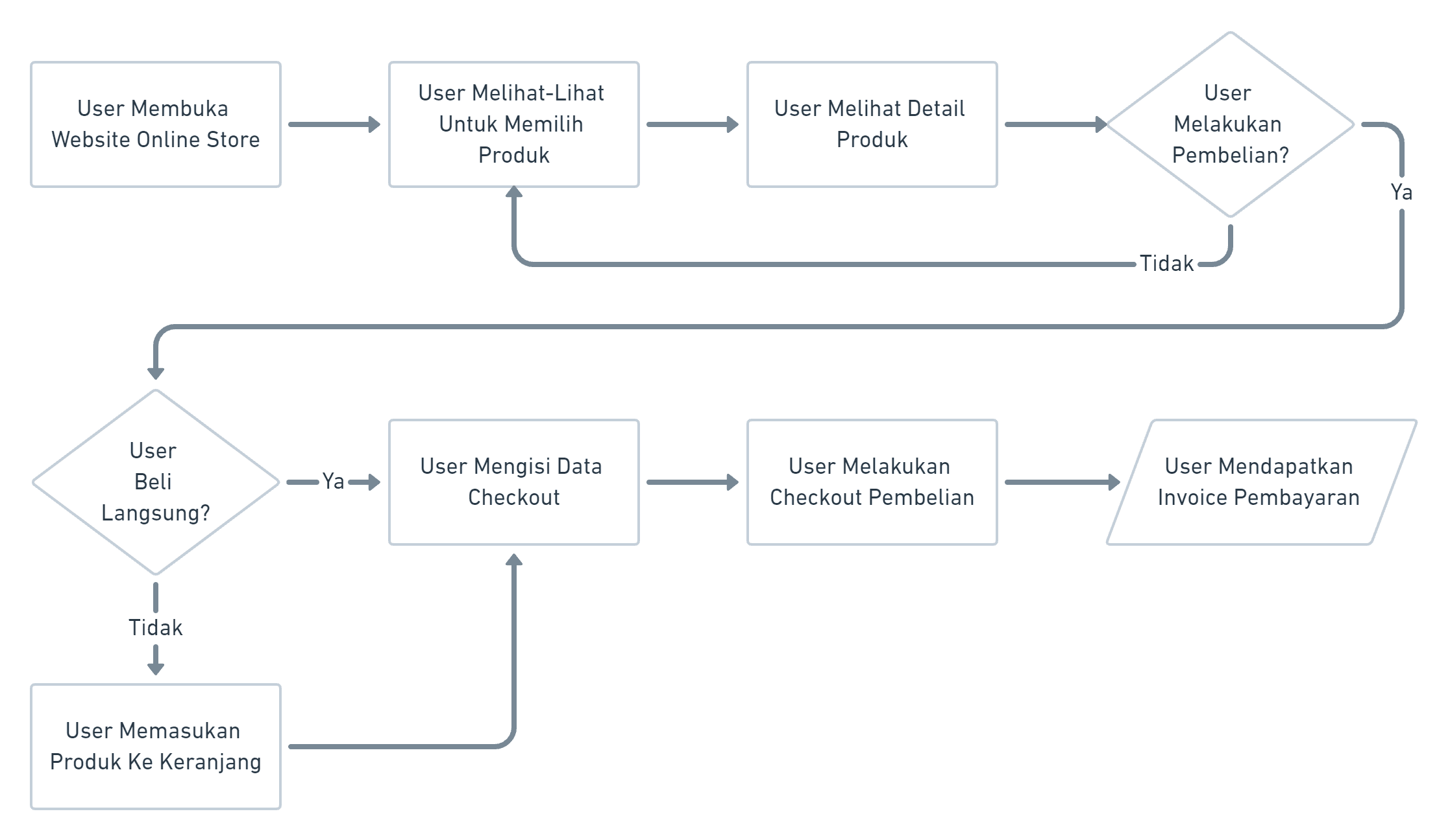
Image: User Flow Checkout Yubipro Online Store
Wireframe
In the wireframing process, we design user flows, layouts, and information organization based on user research.
Wireframe - Homepage
The homepage is designed by paying attention to the priority of the information structure that will be displayed, starting from:
Hero aims to install a slider that can be used as a tool for conveying information, announcements and promotions.
Product Category aims to navigate the products you want to search for based on the desired category.
Special Promotion aims to display products that are on promotion or discount.
Best Seller aims to display recommendations for products that are most sought after and purchased by buyers.
All Products aims to display all products based on the latest product sorting.
Blog aims to display various articles about product education, tutorials, tips, and promotions.
Subscribe to Information aims to provide notification services for product updates, promotional info and the latest news from online stores.
Footer aims to display store services ranging from contact information assistance services, available shipping services and available payment methods.

Image: Wireframe Homepage
Wireframe - Product Details
Product pages are designed with the anchoring effect principle, focusing on the most important product information that appears first to influence purchasing decisions. Here is the product detail wireframe structure:
Product Information: Clearly displays the product name, price, category, variants, shipping, and details.
Product Image: As a picture superiority effect to make it easier for users to recognize and remember the product.
Reviews and Ratings: As social proof to build trust and influence purchasing decisions.
Call to Action: Provides a button that encourages users to make a purchase immediately.

Image: Product Details Wireframe
Wireframe - Shopping Cart
The shopping cart page displays a list of added products, the total price, and a clear call to action button to proceed to checkout.

Image: Shopping Cart Wireframe
Wireframe - Checkout
The checkout page is divided into 2 main layouts that are adjacent to the right and left. The left side contains the recipient information form, product list, shipping and payment methods. The right side contains vouchers, shopping details and a call to action to the invoice page.

Image: Checkout Wireframe
Wireframe - Invoice
The invoice page focuses on displaying information about structured shopping payment bills. The information structure is sorted based on the most important priorities starting from purchase status, payment deadline, payment purpose, total payment, order details, shipping details, recipient details, and transaction details.

Image: Invoice Wireframe
The Design Solutions We Created
The design solutions we create go through two stages, starting from creating a high-fidelity design to creating an interactive prototype.
High-Fidelity Design
High-fidelity design is a continuation of the wireframe design stage that has been made to be more visualized like a real display. In making high-fidelity Yubipro online stores, you must also pay attention to the existing product design style, both typography, color, components and others.
High-Fidelity - Homepage

Image: Homepage Hi-Fi
High-Fidelity - Product Details

Image: Product Details Hi-Fi
High-Fidelity - Shopping Cart

Image: Shopping Cart Hi-Fi
High-Fidelity - Checkout

Image: Checkout Hi-Fi
High-Fidelity - Invoice

Image: Invoice Hi-Fi
Interactive Prototype
Armed with the existing high-fidelity design, the next step is to create an interactive and clickable prototype, this aims to add to the product usage experience to make it more real. This prototype focuses on connecting and creating interactions between pages and components according to the Yubipro checkout user flow.
The Results We Got
After the prototype was usability tested, implemented and released in a few months. We followed up according to the goals of the latest version of the Yubipro online store redesign, which is to increase the number of checkouts or orders that are successfully completed by buyers.
So at this stage we took a sample of 5 large Yubipro merchants based on the number of transactions and active subscriptions using the latest version to measure the number of paid checkout transactions made by buyers at the merchant's online store from October - December 2021 (this was taken from 1 month before the release and 2 months after the release, the redesign of the Yubipro online store was released right at the beginning of November 2021).
From these 4 merchants we got the following results:
- There was an increase in checkout transactions at online stores Buku ** **, Yubi****, Sasak ***** *** and Asgar ****** in November and December.
- The total overall checkout transactions at online stores illustrate the release of the latest online stores making a stable increase starting in November 55% and rising again in December 71%.

Image: Merchant Checkout Transactions October - December 2021
Final Insights

Image: Yubipro Mockup Latest Version
The results of this case study show that the redesign of the Yubipro online store successfully achieved its main goal, which was to increase the number of successful checkouts completed by shoppers. After the implementation and release of the latest version, there was a significant increase in paid checkout transactions, with a steady increase of 55% in November and an additional 71% in December.
This improvement reflects that improving user flow and optimizing the checkout experience can have a real positive impact, helping merchants achieve more successful transactions.