
Yubipro - Redesigning the Online Store Registration Page
Category
Web Design
Product
E-Commerce
Created
Feb 23, 2022
Overview
Yubipro is a website-based online store platform from Yukbisnis Indonesia which was founded in 2012. Currently, more than 5000+ merchants or business people use Yubipro to manage their online stores.
In 2021, Yubipro has released the latest online store, after in the previous version we felt many shortcomings both in terms of technology and user experience. This is certainly based on research that has been conducted on Yubipro Merchants.
Why We Want to Redesign?
After the release of the latest version of Yubipro online store, we conducted a promotional campaign with the aim of getting new merchants or acquiring merchants from other competitors. However, in the middle of the journey based on reports from Customer Service and the Marketing Team, we found several problems experienced by prospective merchants who were going to register for a new online store. The problems that occurred were generally based on poor user flow, which caused a lot of merchant confusion in registration, resulting in merchants failing to register and not being able to make subscription payments.
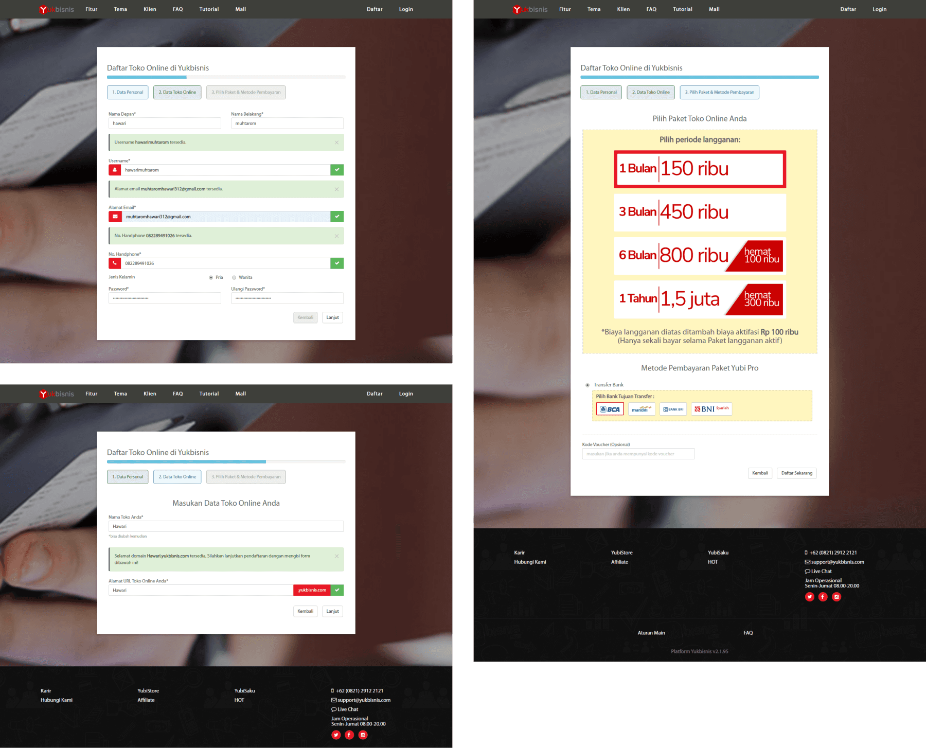
Image: Old Version of Yubipro Merchant Registration Page
Based on the problem report, UX Researcher conducted research to find out more about the problems that actually occurred. The research was conducted by viewing and analyzing the user activity track record on Hotjar (an application that helps the process of collecting qualitative data from web visitors).
Heatmap Data Analysis
The initial stage of the research began by identifying problems through user activity records on the Yubipro registration page. The user activity heatmap used as a sample for this research was during the registration promotion campaign period. The following are the results of the heatmap image obtained based on the specified time:

Image: User Registration Activity Heatmap
We found several indications of problems or pain points experienced by prospective merchants who wish to register, including:
Heatmap data shows an indication of user distraction in the tab step column "2. Online Store Data", where users should focus on filling in the first tab step column first.
The number of clicks on the name input is unbalanced, first name 110 clicks, last name 90 clicks. The indication could be confusing for users who have names with more than 2 words or only 1 word.
Username input is an obstacle because the system only uses the first and last name to generate a username, which is often already used by other users. This causes the number of clicks on the username input to reach 220 times, more than the name input, indicating inefficiency and potential problems.
For us, currently gender data is not urgent data in the user acquisition process on the home page so that it can be filled in at another stage after the user can register.
Password input does not have an option to display the password when refilling, making users hesitate, this causes 110 clicks to input the password and 76 clicks to confirm, which indicates potential confusion.
The Challenge
From the analysis of the problem we draw conclusions by producing recommendations that aim to inspire the product or feature to be created. Here are the recommendations produced:
Simplifying the registration flow into one page, where the current registration page has a flow that is divided into several steps starting from filling in personal data, online store data, selecting a package & payment method, then if successful it will be directed to the payment invoice.
Simplifying or reducing additional data or data that can be filled in after registration.
Eliminating parts that are not too important and hinder users from both the system and thinking time.
Users can easily check the data entered on one page without having to return to the previous step or page, this is expected to be more efficient.
Our Desired Goals
In redesigning the latest version of Yubipro registration, the main objective is to increase the acquisition of the number of new merchants who successfully register their online stores and subscribe.
Finding The Solution
After getting the recommendation results from the research that has been carried out, I as a UI UX Designer followed up on this by creating a concept or solution idea that takes into account each point of the recommendation. The concept idea is formulated by creating a user flow, collecting design inspiration and wireframes.
User Flow
In the first ideation stage, we focused on simplifying the registration flow, starting from making a single page for filling out the registration form without tab steps and being directed directly to the subscription payment invoice with the aim of increasing subscription payment conversions.

Image: Merchant Registration User Flow
Design Inspiration
We looked for design inspiration that focused on a simple, one-page signup page, without multi-tab steps, to avoid the issues we had previously encountered.

Image: Registration Page Design Inspiration
Wireframe
In the second ideation stage we create a wireframe. In the wireframing process we will design the visualization of the user flow, layout arrangement, to the arrangement of information. One of the most important things in wireframing is the arrangement of information where this will be easier if we already know what information the user needs to help their work. So armed with recommendations from previous research results, it is very easy for us to detail all the information needed to be included on each page.
Wireframe - Registration/Sign Up Page
This page covers filling in several parts of the data directly without using the tab step which previously in our case was a problem. By displaying all the filling parts on one page, it is expected to make it easier for users to fill in and check the data that has been entered simply by scrolling.
The data displayed on this registration page is arranged by considering the priority between each section. Here is the arrangement of the priority list for filling out the registration form:
Store and Owner Data
Subscription Packages
Payment Methods
Payment Details

Image: Registration/Sign Up Wireframe
Wireframe - Invoice Page
The invoice page displays the subscription payment bill after registration. Merchants can pay immediately or choose to pay later before the specified deadline, or in other words, merchants can still access the online store dashboard without having to pay directly.

Image: Invoice Page Wireframe
The Design Solutions
We design solutions by creating high-fidelity designs and clickable interactive prototypes. The prototype design focuses on the details of typography, color, components, and interactions in each element.
Registration/Sign Up Page

Image: Registration Page High-Fidelity
Invoice Page

Image: Invoice Page High-Fidelity
The Results We Got
In the final stage after the registration page design prototype has been tested, implemented and released in a few months, we want to see the results of the development of new merchant acquisition.
So we measured by taking a sample of successful new merchant registration data in the period October - December 2021. The determination of the time span was seen from the comparison of 1 month before the release with 2 months after the release, the redesign of the Yubipro merchant registration page was released in November 2021.
Our results show a steady increase in the number of new merchant accounts after the release of the new registration page, with an increase in registrants in November and December.

Image: New Merchant Registration October - December 2021
Our Conclusion

Image: Yubipro Registration Mockup Latest Version
The results of this case study show that the redesign of the Yubipro merchant registration page successfully achieved its main objective, which was to increase the number of new merchant accounts registered. After the implementation and release of the latest version, we saw a significant increase in the number of merchant registrations, with an increase in November and December.
This improvement shows that simplifying the registration process and improving the design has succeeded in increasing new merchant conversions, providing a real positive impact for the Yubipro platform.